We’ve covered a lot of Mixvibes products here at Crossfadr. They’re a prolific little company, going head to head with a prodigious barrage of hardware, software, and apps – so far centred almost exclusively around their flagship mixing program Cross – against some titanic competition. Unlike the slower-moving juggernauts, they’ve proven themselves to be quickly adaptable and able to take advantage of the new wave of media technologies. In a relatively short time they’ve released multiple issues of Cross for XP, Win 7 and OS X, a handful of hardware controllers, headphones, a vinyl control pack, as well as apps for iPad and now iPhone.
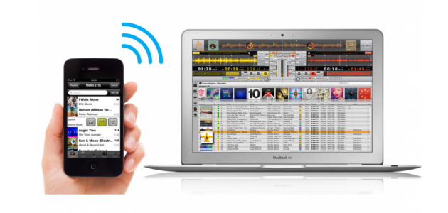
Which is why we’re here: to check out Cross DJ Remote, a controller app for iPhone and iPod Touch. Like its iPad brother, U-Mix Remote, Cross DJ Remote is mercifully painless to setup over Wi-Fi with the host computer, comes with a bundle of easy-to-follow instructions, and is packaged such that the whole process, from deciding to buy through to playing music with your phone, can take just a couple of minutes. That’s an excellent start.
In portrait, we’re first greeted with the Info screen, split vertically into decks A and B. Now this is a handy reference screen that you’ll come to use pretty regularly for its simple, text-only display of vital information, but it’s not a terribly attractive first view, especially since the decks are empty and there’s basically no information here yet. Luckily for us, there are four buttons at the top that lead to other screens for effects, loop controls, and locators.
The effects page gives us some graphics – a power button, a dropdown to choose one of Cross’s built-in effects, and a depth knob for each deck. The controls are a good size for blunt thumb manipulation, although I’d be happy to trade some space for more functionality. That’s a function of Cross, not Remote, though: the software itself only has these parameters to control.
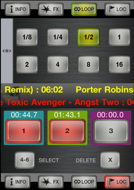
The loops page has two display types, one arranging the loop length buttons into a two-by-four grid, the other giving the current loop length value between plus and minus buttons, for smooth incremental adjustments. This dual layout might a bit redundant, but it’s nice to be spoiled for choice.
The final portrait page is dominated by three big buttons on each deck, which is where we’ll store our hot cues (called locators). A smaller button switches between two banks for a total of six cues per deck, and a Shift-clear button completes the scene.
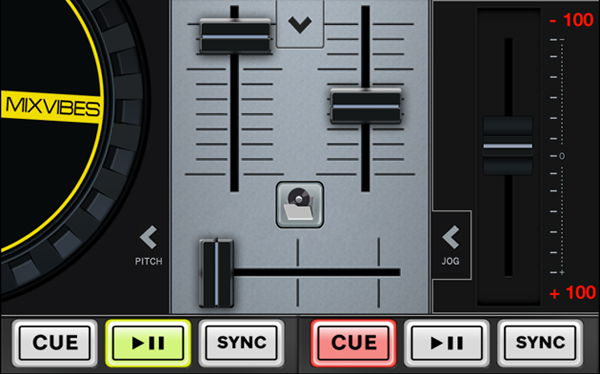
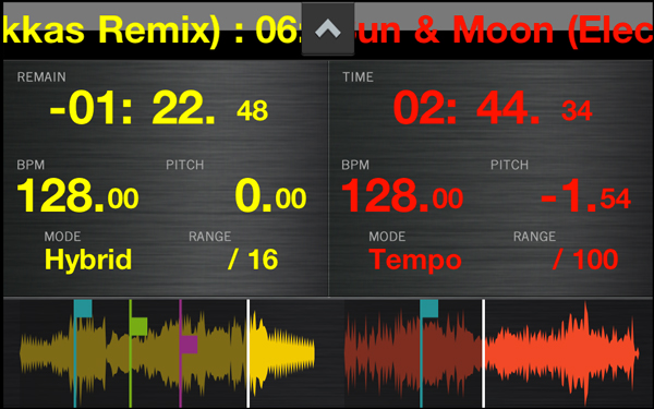
Landscape mode is where the graphical fun is at. The default landscape screen gives us the familiar yellow and red platters and steel mixer. Play, Cue, and Sync buttons line the bottom edge of the screen and a pitch button swaps each platter out for a tempo slider. There’s another small button at the top-centre, unmarked except for an arrow, and it leads to our waveforms, cue, and loop brace positions, scrolling marquee and fader type and range options, as well as text displays for time, tempo, and pitch.
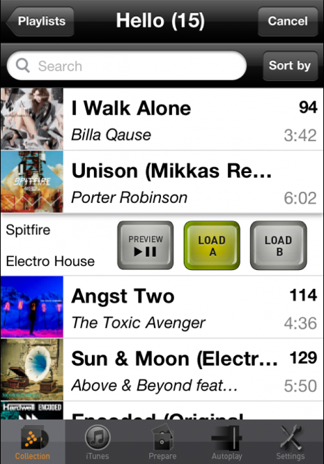
There’s one last button, for the browser. Access your Mixvibes library and (host) iTunes library, work on your preparation crate or, if you must, take advantage of Cross’s automix feature. The settings page also comes off the browser, although the in-app settings are limited to a couple of sound routing options and the library sort and display criteria.
At this point, I’m happy with the app but I’m still wondering – why? A four-inch screen is no way to DJ, regardless of how well used that screen is. But then of course, it’s a screen that umpteen million people around the world carry in their pocket every day, isn’t it? And maintaining consistency of design and reliability across a breadth of platforms like this helps keep Mixvibes fresh and relevant, different from their mountainous opponents; it broadens their programming, marketing, and business experience and it doesn’t hurt their branding one bit.
But mostly, I think, because it’s a cool thing to have. Using your phone may not be the full tactile DJ experience we live for, but the fact that you can do it at all is worth celebrating. And for all its tiny trappings, an iPhone is still better than using a keyboard and mouse when you’re jamming with friends on the lounge as the party’s winding down.
