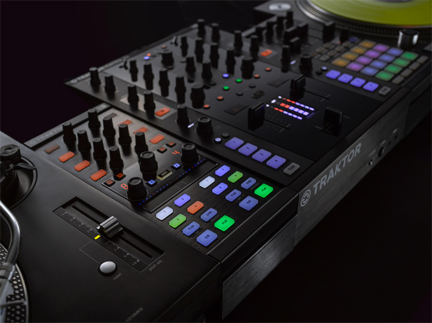
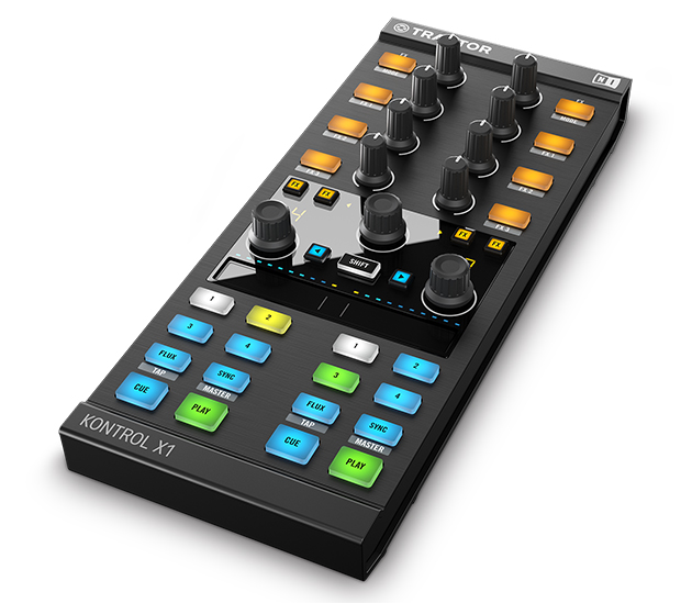
 For some time now I have mistakenly ignored the Traktor Kontrol X1 MK2 by Native Instruments. The original Kontrol X1, while one of my favorite controllers for years and certainly revolutionary for its time, had slowly fallen out of my favor as newer, and what I thought to be better, controllers have come and gone. While its seamless and effort-free integration with Traktor was impressive, I felt the original Kontrol X1 had some serious limitations, such as the inability to perform any sort of fine adjustments with regard to pitchbending or navigating beats. When looking at the MK2, I reasoned, any new entry to the Kontrol X1 family would be similarly disappointing. Luckily, I couldn’t be more wrong.
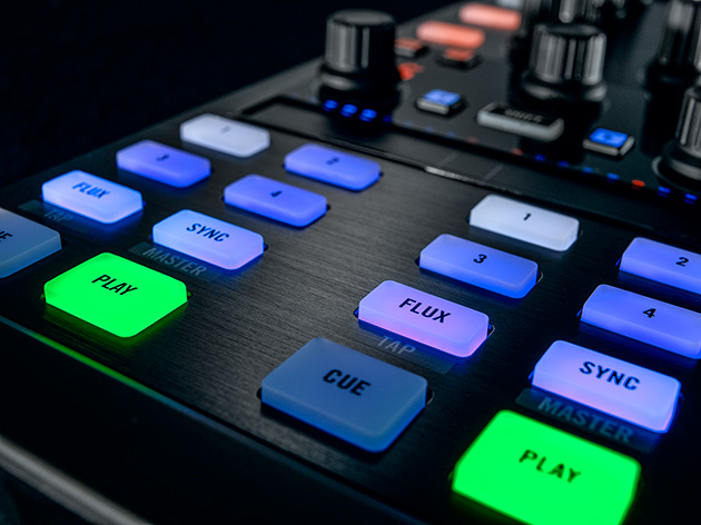
If there’s anything the Kontrol X1 MK2 demonstrates best, it’s that Native Instruments has learned from the limitations of its previous product, fixed those issues, and gone even further to ensure that the X1 MK2 is just as much of a stunner as the original X1 was many years ago. The first thing I noticed about the Kontrol X1 MK2 was the injection of color and life into the unit’s overall look. While the muted orange and blue colors of the original Kontrol X1 fit in well enough with the Traktor Pro aesthetic, the vibrant colors of the MK2 seem so much brighter and more alive. The next big aesthetic change comes in the form of a large, glossy LCD unit in the middle of the controller. It’s not only flashy – it’s highly functional.
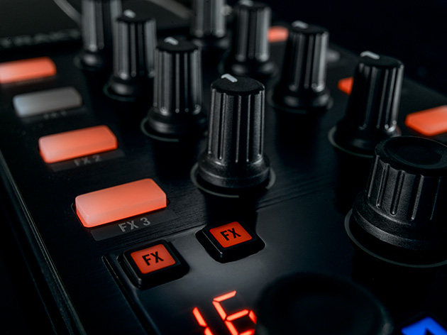
In fact, while much of the Kontrol X1 MK2’s layout remains roughly the same, most of the new and improved functionality is located right in the central LCD unit. One particularly helpful upgrade is located just above the loop adjust knobs. A quick display of the beat count on each loop, while it can also be found on the software itself, is a helpful thing to have on the face of the controller while you’re manipulating your sound. Browsing and loading tracks is also a much simpler affair, thanks to the touch-sensitive browse knob which automatically switches to Traktor’s browser view when it senses a human touch. By far the most helpful feature added to the Kontrol X1 MK2 is its multi-capable touchstrip. Most significantly, it adds full jogwheel functionality to the Kontrol X1 without taking up too much space on an already compact controller! The X1 MK2’s touchstrip can be configured to control one or even two decks at a time, and indicators above the touchpad serve as a sync phase indicator for easy beatmatching. The touchstrip can even be easily configured to control effects like filters or even to launch loops, changing loop length as you navigate the strip.
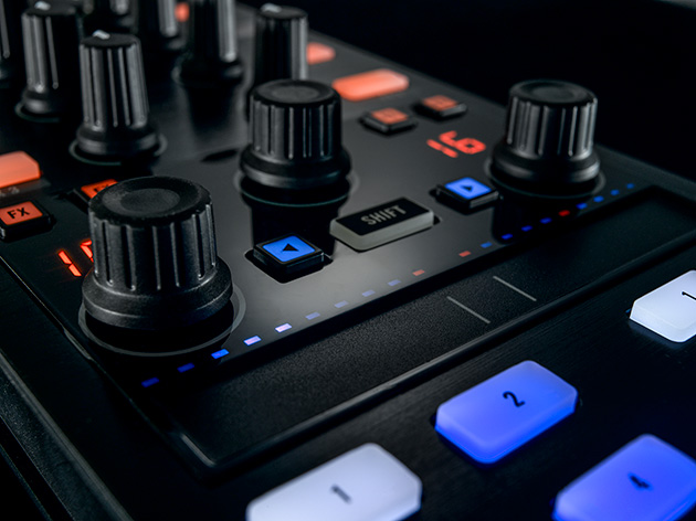
The Kontrol X1 MK2 also features some layout changes which enhance the overall usability of the controller. In its previous incarnation, the X1 featured so many buttons and functions which were not always useful that the most relevant functions often became lost in the clutter. Now, four dedicated hotcue buttons for each deck, play, cue, sync, and the new flux button provide a simple but effective interface for controlling your musical flow. All of this makes for a significant improvement over the original X1. I’m disappointed it took me this long to realize the Traktor Kontrol X1 MK2 isn’t just a simple, more colorful repackaging of the same old controller. Hopefully I can help you avoid the same mistake.
