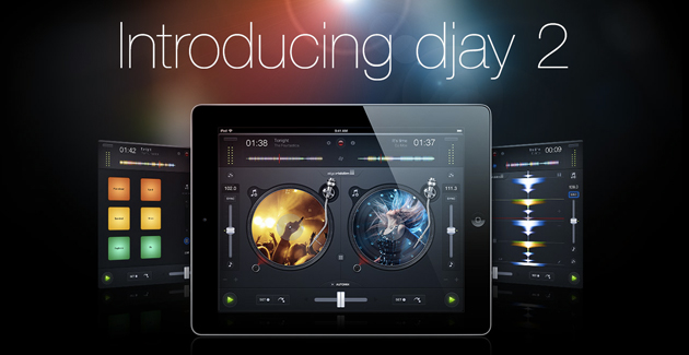
Almost a year ago, I wrote a review of the very popular djay iPad app by Algoriddim. I really enjoyed the app and had very few complaints, so naturally I had high expectations for djay 2 when it was released in July. Although the update to the app isn’t completely groundbreaking, djay 2 does add some useful new features while keeping the same, quality interface that made the first djay such a huge success.
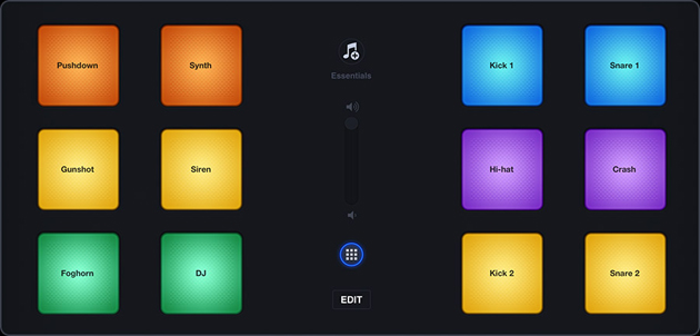
Upon first glance, djay 2 looks a lot like the first djay, making it instantly familiar to many users. However, the new features lie cleverly hidden just below the surface. In the middle of the screen, between the two decks, is a small button with a grid icon on it. After pressing this button, the decks slide out of the way, and the user is greeted by a 12 button sample player. The 12 individual pads are pre-loaded with popular DJ samples (air air air airhooooooorrrnnn) and instruments (kick drum, high hat, etc.) Pressing the “edit” button in the middle of the screen allows you to assign new samples and sounds to any pad that you wish. Djay 2 provides a pretty nice selection of samples within the app, but also gives you the option to record your own samples, which is a nice feature. I really enjoyed drumming out some beats on the pads. They responded well, were large enough to easily hit, and didn’t interrupt the playback of the main decks.

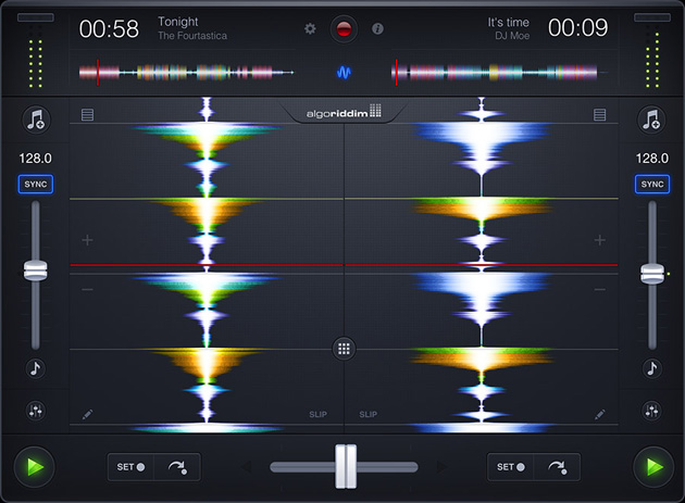
In addition to the standard 2-deck DJ interface, djay 2 also incorporates a new waveform only mode. This can be accessed by pressing the squiggly line button in the upper section of the main screen. The decks are then replaced by two large, beautiful, color-coded waveform displays. This enhanced waveform view makes it very easy to set one or all of djay’s four available cue points. This new mode also allows you to edit the “beatgrid” of a particular song if you choose to do so. Thanks to the enhanced audio analysis of djay 2, I saw no reason during my demo to adjust the preset beat gridding of any track that I played. All of them were gridded perfectly immediately after they were loaded to the deck. The sync buttons on djay 2 work wonderfully, and the large waveforms make it easier to visually beat match 2 songs even without sync engaged (using the pitch slider and bend buttons). I really liked the new Slice Mode, which allows you to use the beats in the waveforms as temporary “hot cues”, making it easy to chop up and rearrange the beats of a track on the fly. Slice Mode can also be switched over to Slip Mode, which is basically a waveform scratching mode. Much like the scratching on djay’s turntable decks, the Slip Mode scratching is pretty decent, but feels more gimmicky than practical. Overall, the waveform only mode is a useful addition to the djay app that feels slightly more professional that the standard 2 deck mode.
Another great new feature included in djay 2 is the single deck mode. There’s really no big secret to activating this mode, simply turn the ipad upright and presto…….you’re in single deck mode. The deck or waveform that is currently playing will enlarge and fill the entire screen. All of the other features and effects of the app are still available, and the extra screen real estate makes it easier to scratch or mix in a track. For me, this single deck mode would be very useful in a live setting. Since I spin on turntables with Serato Scratch Live, I rarely ever use an app as a primary mixing source. I do, however, like to use a DJ app as a third deck. Djay 2 fills this need perfectly by providing a large, easy to use single deck interface with all of the features I need to seamlessly mix a third track into my set.
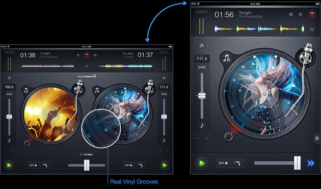
Honestly, the new sample pad mode and the waveform mode are the only two big changes to the djay app. But, there are numerous little changes that make upgrading to djay 2 worthwhile. In the standard turntable deck mode, the virtual vinyl records look more like real vinyl. The breaks in the track are visually identifiable on the record, much like they are on a real piece of vinyl. The music library also displays differently on djay 2. After pressing the “load track” button on a deck, a small window opens to allow you to browse your music selection. I definitely prefer this over the first djay, which opens up the music library in full-screen mode. Another minor change that I found to be very useful is the backlighting of buttons. When you open the effects section (or any section for that matter), the button or icon remains lit until it is pressed again to exit out of that particular section. This is not the case with the first djay, and while using the original app, I often found myself searching for the way to exit out of the effects or looping sections. The backlit icons solve this minor issue and add to the overall user friendliness of djay 2.
All of the same great effects and looping features of the original djay are included in djay 2, with an improved tab-style layout that helps simplify navigation. The effects in djay 2 are identical to the effects in the first djay, with the exception of a new looping/filter effect. Although it’s the only new effect that I spotted, it is a very, very cool effect that utilizes an XY-axis touch pad to simultaneously loop and filter the audio from a track. Combine this with the multi-touch capability of the app (allowing you to crossfade and engage effects at the same time), and you’ve got an awesome sounding new way to mix between tracks.
Overall, djay 2 is a very impressive DJ app. The first djay app felt a lot like a toy to me, but the new features of djay 2 make it feel much more like a professional grade DJ app. With a growing number of hardware manufacturers creating compatible controllers, I have a feeling that djay 2 will find its way into an increasing number of DJ booths over the next year. If you are a fan of the first djay app, the new features of djay 2 definitely make it worth the cost to upgrade. Too me, djay 2 strikes a perfect balance between simplicity and practicality and I highly recommend checking it out.

